- Power BI - Home
- Power BI - Introduction
- Power BI - Installation Steps
- Power BI - Architecture
- Power BI Desktop
- Power BI - Desktop
- Power BI - Desktop Window
- Power BI Service
- Power BI - Window Supported Browsers
- Power BI - Generating Reports
- Power BI Desktop Service
- Power BI - Desktop vs Service
- Power BI - Supported Data Sources
- Power BI - Comparison Tools
- Power Query Editor
- Power Query Editor - Introduction
- Power Query Editor - Data Discrepancy
- Power Query Editor - Merge Queries (Part 1)
- Power Query Editor - Merge Queries (Part 2)
- Power BI - Develop Star Schema
- Data Modeling Concepts
- Power BI - Data Modeling
- Power BI - Manage Relationships
- Power BI - Cardinality
- Power BI - Dashboard Options
- Power BI Report Visualizations
- Power BI - Visualization Options
- Power BI - Visualization Charts
- Power BI - Stacked Bar Chart
- Power BI - Stacked Column Chart
- Power BI - Clustered Chart
- Power BI - 100% Stacked Chart
- Power BI - Area Chart and Stacked Area Chart
- Power BI - Line and Stacked Column Chart
- Power BI - Line and Clustered Column Chart
- Power BI - Ribbon Chart
- Power BI - Table and Matrix Visuals
- Power BI Map Visualizations
- Power BI - Creating Map Visualizations
- Power BI - ArcGIS Map
- Power BI Miscellaneous
- Power BI - Waterfall Charts
- Funnel Charts and Radial Gauge Chart
- Power BI - Scatter Chart
- Power BI - Pie Chart and Donut Chart
- Power BI - Card and Slicer Visualization
- Power BI - KPI Visual
- Power BI - Smart Narrative Visual
- Power BI - Decomposition Tree
- Power BI - Paginated Report
- Power BI - Python Script & R Script
- Power BI - Multi-row Card
- Power BI - Power Apps & Power Automate
- Power BI - Excel Integration
- Power BI Dashboard
- Power BI - Sharing Dashboards
- Power BI Sales Production Dashboard
- Power BI - HR Analytics Dashboard
- Power BI - Customer Analytics Dashborad
- Power BI - DAX Basics
- Power BI - Administration Role
- Power BI - DAX Functions
- Power BI - DAX Text Functions
- Power BI - DAX Date Functions
- Power BI - DAX Logical Functions
- Power BI - DAX Counting Functions
- Power BI - Depreciation Functions
- Power BI - DAX Information Functions
Power BI - Creating Map Visualizations
What is Map Visualization?
Map visuals specify the geographical location of the field values through colorful bubbles. You can discover the identity of data points, hidden patterns, and trends are to be uncovered by Map visualizations. The main sections that are available in this visual are the Location, Legend, Latitude, Longitude, Bubble size, and Tooltips through which analysts may construct the interactive Map visual.
Users can provide the precise location of data with the help of the Latitude and Longitude sections. Microsoft Bing maps are to be utilized by Map Visual.
Following are the various types of visuals to create a Map in Power BI Desktop −
- Map Visual
- Filled Map
- Azure Map
- ArcGIS Map for Power BI
Map Visual in Power BI
The sample dataset is embedded into the Power BI Desktop and its structure is shown in the screenshot.
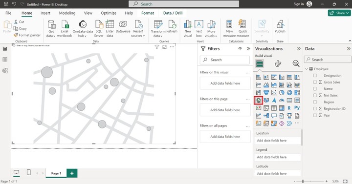
Switch to the Report View and click on the Map visual. The empty Map visual will be inserted on the Report as shown below −
To add the fields, drag and drop the "Region" column into the section named Location. Similarly, drag the "Gross Sales" column and place it into the "Legend" part as it differentiates all the designated data points in different colors.
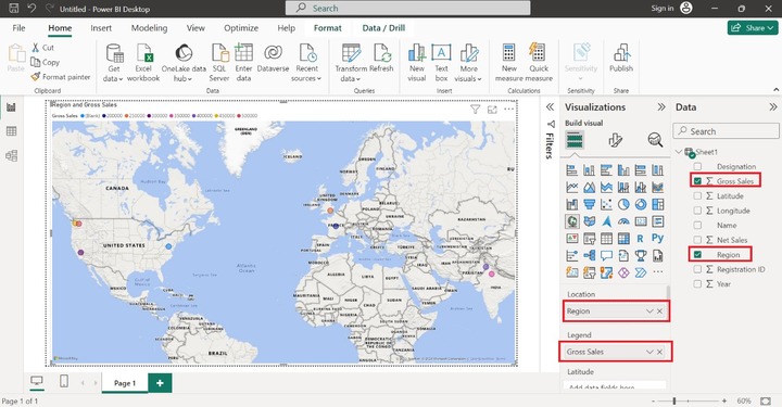
Then simply drag and drop the "Latitude" and "Longitude" columns into the Latitude and Longitude sections. These sections fairly find out the data points accurate location.
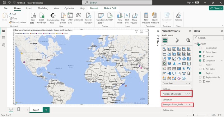
By default, bubbles are of the equivalent size. Suppose you want to alter the size of the bubble according to the Gross sales of the company. To accomplish this, drag and drop the Gross Sales column into the Bubble size section.
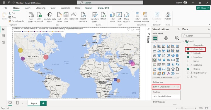
The image below illustrates how the size of the bubble changes about the total amount of gross sales. The larger bubble indicates a higher total of gross sales, while the smaller bubble represents lower gross sales.
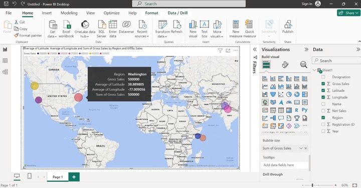
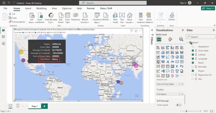
The Tootips section is optional and is used to get detailed information on the field value. Users may hang around over any bubble, more information about the specific data point is to be showcased like Region, Gross Sales, average of Latitude, Average of Longitude, and Sum of Gross Sales as shown below −
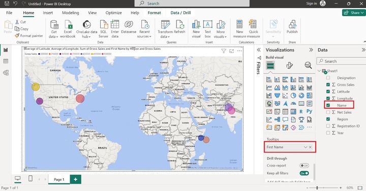
If you want to see the Name of the employees in the detailed information. Drag the "Name" column and place it in the "Tooltips" column as given below:
Now, place the cursor on the data point, and we get the comprehensive information along with the Name as shown below:
How to Create a Filled Map in Power BI?
Open a Power BI desktop and load the sample database in it. The structure of the sample dataset "Workers" is shown below:
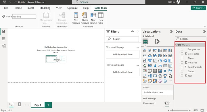
Note: Make sure that the States column should be present in the worksheet. Latitude and Longitude columns are optional.
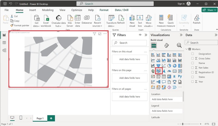
Navigate to the "Report View" and select the "Filled Map" icon in the "Visualizations" pane and the default filled map will be developed that has no field values. You may increase the size of this visual.
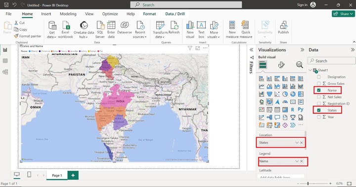
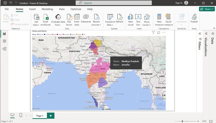
Drag and drop the "States" column into the Location textbox and place the "Name" column into the Legend textbox. Categorical data would be utilized in the Legend section to fill the different colors in distinct regions. The different names are showcased in the different colors. Once we place these columns, the employees corresponding states that belong to the Indian country are highlighted in the Filled map.
The other sections like latitude and longitude are optional since they are needed to pinpoint the location of the field values. However, these sections are not functional on the Filled Map. To gain deep insights into the data points, just hover over a specific data point, and we get more detailed information like Name - Jennifer belongs to Madhya Pradesh state. Similarly, we can also obtain the comprehensive information of other employees.
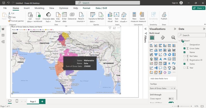
In the above image, the Tooltip only provides the State and Name information of the employees. Let's drag and drop the "Gross Sales" column into the Tooltips section. If you hover at a pink area, then Esha's Sum of Gross Sales information along with her belonging States and Name are depicted in that region as given below:
TreeMap Visualization
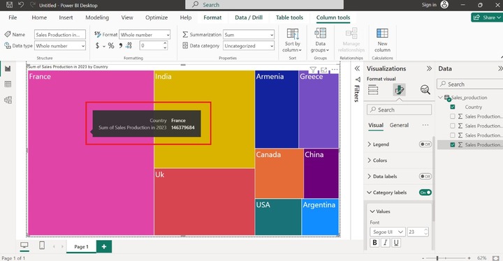
A treemap shows the data in organized rectangles and reveals the structural connections between the data. These rectangles come in various colors, with the biggest one positioned in the upper left corner of the Treemap and the smallest one in the lower right.
The sub-rectangles are arranged in ascending order, from the highest to the lowest form. For instance, the highest sales production of the state is depicted on the upper left side of it. You can spot patterns, trends, and anomalies that could have gone unnoticed by combining many kinds of data into a single Treemap.
Example − How to visualize the sum of Sales production in 2023 by country through Treemap.
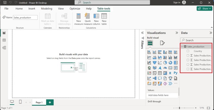
You may load the table "Sales_production" in Power BI. The structure of the dataset is highlighted in below image −
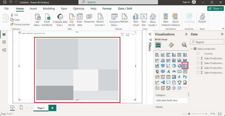
Now, click on the "Report View" and select the "Treemap" icon, the default Treemap doesn't contain data points as depicted below −
Drag and drop the "Country" column in the "Category", pull the "Sales Production in 2023" column, and place it in the "Values" section. You may customize the size, font, and colors of data points. Now, increase the size of the data. Expand the "Category Labels" tile and then click on the "Values" tile and set the "Font" size to 23 as given below −
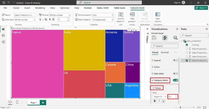
In the above image, France made up the highest sales production in 2023 and Argentina constructed the lowest production.
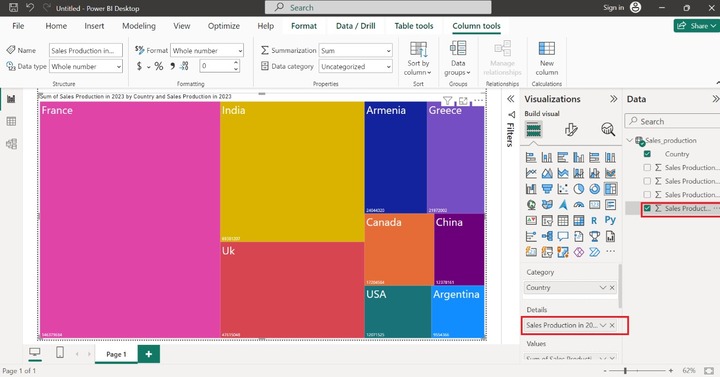
Drag and drop the "Sales Production in 2023" in the "Details" section to depict the sum of sales of distinct countries.
If we hover over the pink rectangle to determine the tooltip for the France country on treemap.